Adding Research Data and Visuals in Business Videos Using CapCut’s Overlay Feature
Data visualization in business is necessary for effective and fruitful communication. When sharing the progress of your company, data must be represented through graphs, pie charts, or other visual elements, rather than roughly stating them in text.
Also, visual representation makes data easy to compare with past performance. According to reports on the internet, data visualization makes it easy for stakeholders to memorize the concept (Tech Target). However, if you struggle to integrate such elements into your reports, using video editing software like CapCut can ease the issue. CapCut’s video editing tools are able to make the editing process feel like a breeze.
Integrating the powers of data visualization and a powerful video editing tool can effectively make results shine. So, keep reading to learn more about it.
Why Research Data and Visuals Are Crucial in Business Videos?
Data visualization is all about accommodating the most amount of information in the least words possible. Unlike in text, where tons of words convey the message, data visualization shares much more information just with the help of graphics and a few words.
Apart from that, visualization helps businesses in the following ways:
- Isolating factors that affect customer behaviors
- Find out what products and services need to improve
- Data visualization makes data more memorable
- It helps organizations in better product placements
- Prediction of future sales and volumes
If these are not enough, your presentation or report will be able to hook the audience with the help of visualization.
Introduction to CapCut’s Overlay Feature
For your business needs, CapCut’s overlay is the most relevant feature along with the video background remover. Whenever creating a presentation or a report, using overlays helps add interactive elements, guide navigation, and increase conversions.
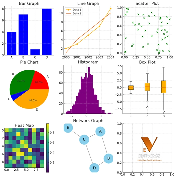
The following are some examples of overlays:
- Bar Graphs: Use columns and bars to share data and information
- Line Graphs: Used to show variable changes over time with simple lines
- Pie Charts: Show different parts of the data dividing the portions out of a circle (like a pie).
There are numerous other ways as well through which data can be turned into graphics. However, each one of them is used to portray each kind of data. Hence, you have to figure that out.
One thing you need to note is that the data you are going to add must be legitimate from reputable research. Adding research data not only makes it more strong to commit but also adds to the reputation.
How to Add Research Data to CapCut?
Follow the given guidelines and make your presentation more engaging than ever:
- Find out the data that you want to add to your project. The source can be a video, report, government website, or anything. Convert the information into a graph with the help of Canva or Excel.
- Open your project in CapCut and import the visuals.
- Add to the overlay and figure out how you want to position or adjust the overlay.
- Generate a preview, make edits if there are any, and finally export them as you like.
With these simple steps and procedures, it just takes a few minutes to effectively generate final projects.
Tips on Effective Visual Integration
If you have already made a few outputs, but are not happy with the quality, follow the given steps:
- Consistency: You need to make sure that the color and fonts of the project align with your brand.
- Simplicity: The visuals must be easy to read and understand. Avoid using complicated elements and try to make it as simple as possible.
- Relevance: The statistics and information must be directly related to the narrative or the message you want to convey.
- Engagement: Using interactive elements like questions, reviews, prompts, animations, auto-captions, and others, can make your project highly engaging and interactive.
Start working on these tips and notice the change in reviews of your presentations.
Common Mistakes to Avoid When Using Overlays
Now that you have helpful tips, there are still some chances that you are going to make mistakes. Hence, the following are some points you need to consider:
- Add only the information that is needed, and do not overload it. It makes the report or presentation more difficult to read and understand.
- A bad placement of the infographic can make it look ugly and unpleasant to watch. Hence, make sure that the place is relevant, and the spaces are uniform at all corners.
- Do not forget that your project must be optimized for mobile phones as well.
If you have worked on these mistakes and implemented the tips mentioned earlier, nothing can go wrong with your project.
Statistics
With the current 4.66 billion active Internet users worldwide, 2.5 quintillion bytes of data are generated each day.
End Note
Data visualization is truly something that can elevate your information-sharing capabilities and speak so much in minimum words possible. However, to convey those messages the right way, you need to find the right platform that can help.
With the help of CapCut, you can do so. Hence, start using it as soon as possible.

Finance Writer